A marker and poster board get you started in under an hour, while a glittered stop sign or a life-size cardboard cutout takes an afternoon and steady hands.
Pick by distance, because a car poster has to read from the curb and a hallway sign only has to win a few seconds of a passing glance.
The list covers stylized portraits, hand-drawn lettering in block or glitter form, lollipops tied to signs, feather boa borders, and food puns that turn a donut or taco into a vote request.
1. Homecoming Queen Car Poster
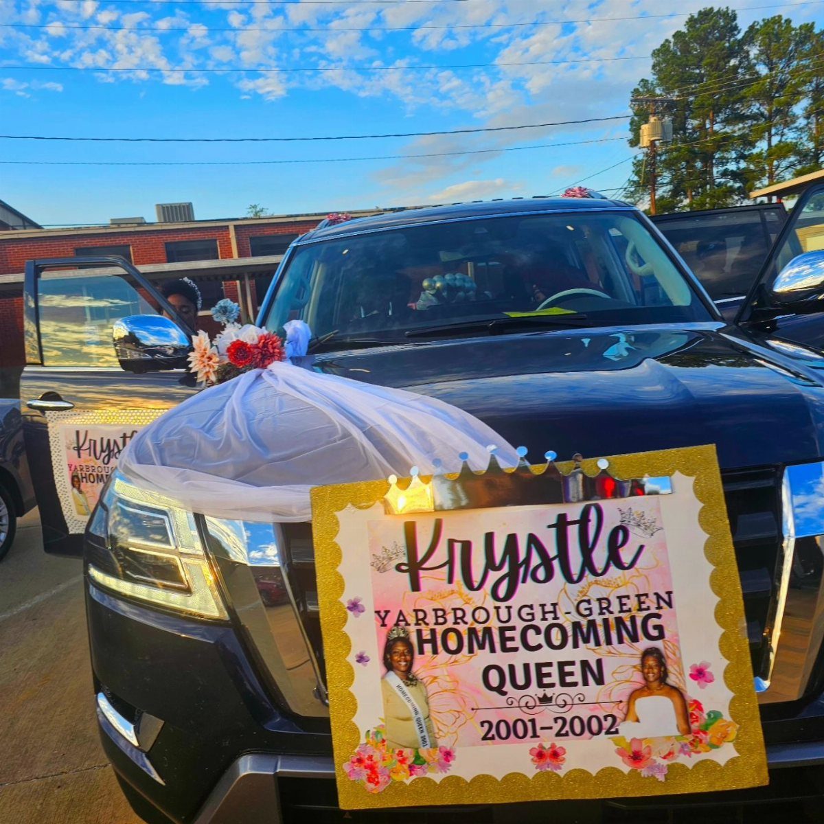
A poster built for a car has to read from the curb, so the name and the title matter more than any fine print.
2 photos plus a name and a year is about all a grille can hold before it turns into clutter.
Tulle and flowers around the poster soften the hard edges of the vehicle. White tulle photographs cleanly against a dark car, so pick a color that contrasts with whatever you are driving.
2. Lollipops Tied to Campaign Signs
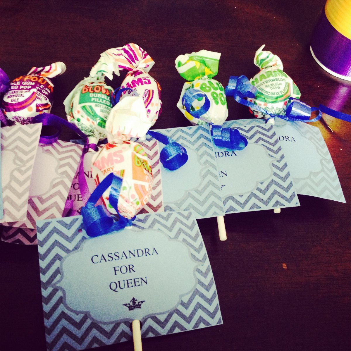
Candy does the persuading here: a lollipop tied with a ribbon makes people keep the sign instead of tossing it. Small chevron signs with a short line like "CASSANDRA FOR QUEEN" keep the message quick to read.
Ribbons in a few different colors add variety for very little money. Buy a bag of lollipops, cut the ribbon in equal lengths, and tie each one before you attach it so the bows match.
3. Stylized Portrait Posters
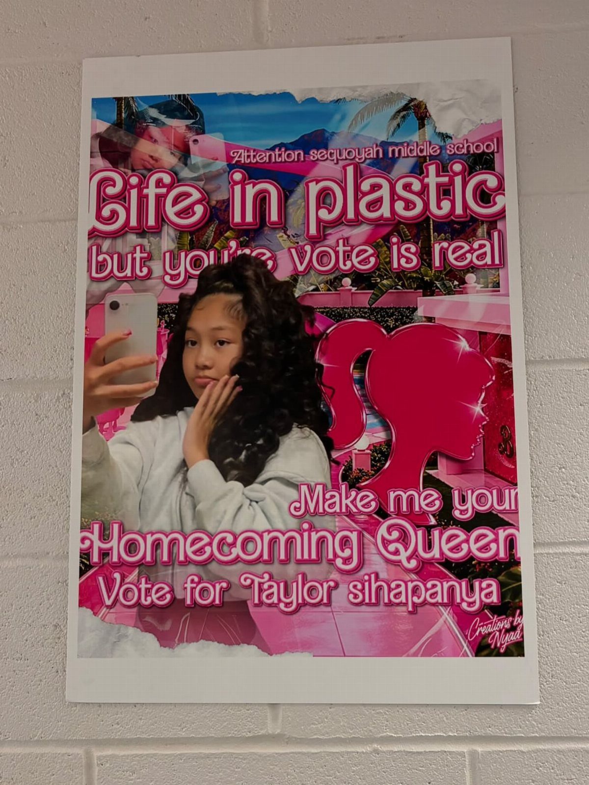
A selfie-style portrait, a single color family and one playful phrase are enough to make a poster look designed rather than printed.
Pink does the heavy lifting in this version, and a line that riffs on a pop reference, like "Life in plastic but your vote is real," gives people a reason to read the name below it.
I would keep the text to 2 lines. The photo is the star, so choose a shot where you look relaxed, and print it large.
4. Hand-Drawn Lettering
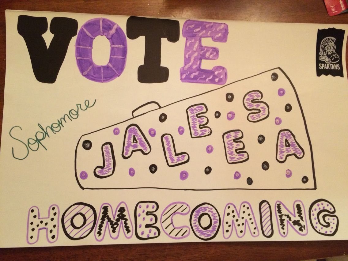
Hand lettering costs a marker and a sheet of white paper, which makes it the cheapest route on this list.
Purple and black outlines, a quick megaphone sketch and your school logo give the poster a personal feel that printed text can’t match.
Pencil your words lightly first so the spacing holds, then trace with markers. Shaky letters read as charming; uneven spacing reads as rushed.
5. Colorful Block Letters
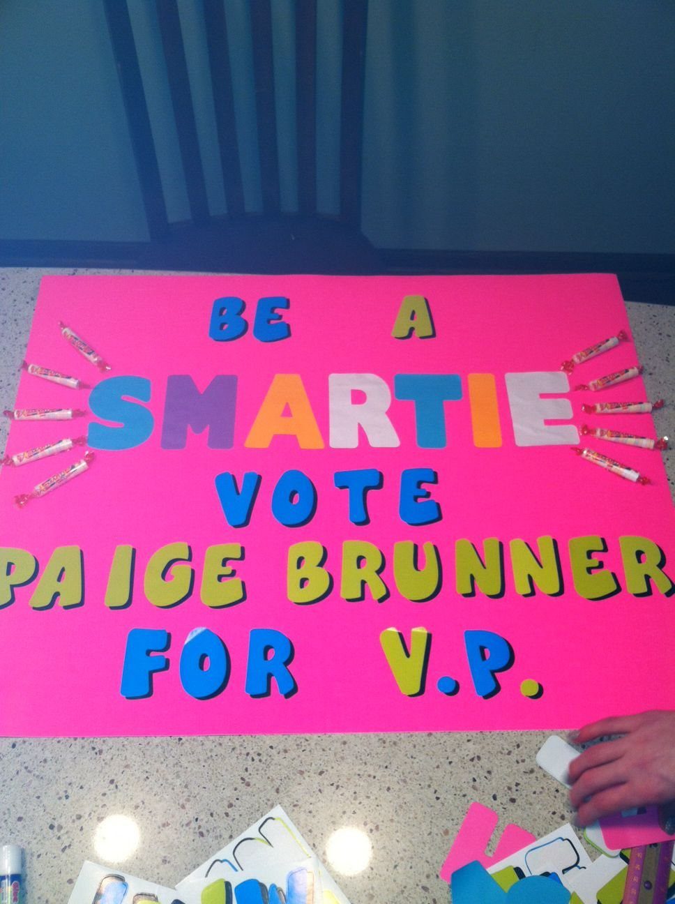
Big block letters in mixed colors are the fastest way to get a poster noticed down a crowded hallway.
A pun like "BE A SMARTIE" ties the lettering to the candy stuck along the sides, so the design and the treat make one joke.
Use a pink or other solid background so each colored letter stands out. Tape the candy on last, after the lettering is dry, so nothing smudges.
6. Glittery Lettering
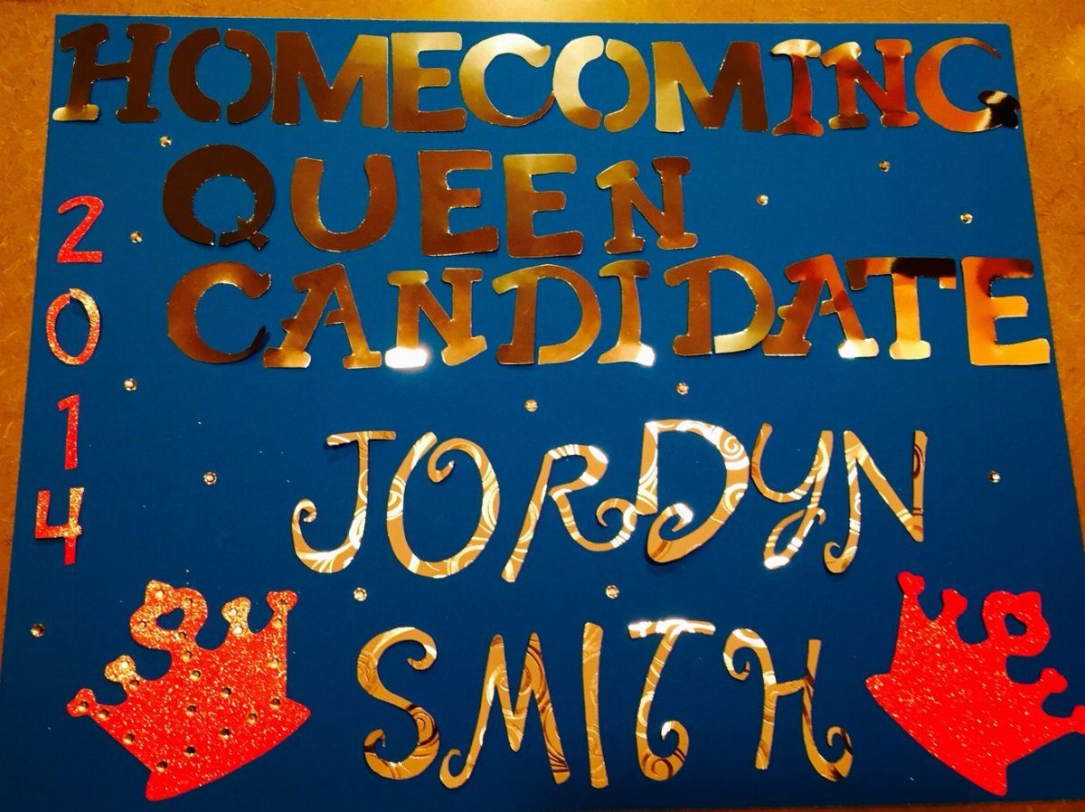
Gold glitter on a blue background gives a poster shine that catches hallway light, and you get it from a glue pen and a bottle of glitter.
Red glittery crowns at the bottom add a second pop of color and tell people what the race is.
Outline the letters in glue before sprinkling, and shake the extra back into the bottle. Glitter sheds, so tap the poster over a tray before you hang it.
7. Stop Sign Shape Poster
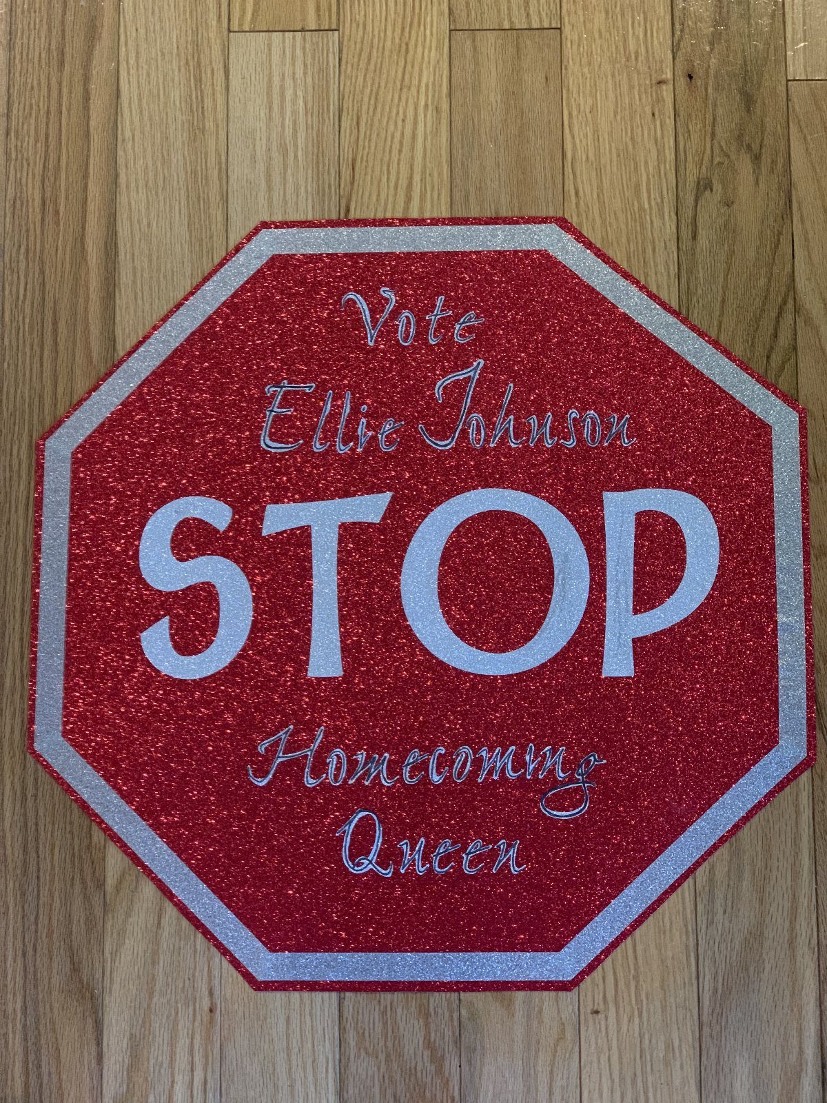
Cutting the poster into an octagon turns the whole sign into the joke, so the word STOP does half the work before anyone reads a name.
Red glitter with white and silver lettering mimics the real thing, and "Vote Ellie Johnson STOP Homecoming Queen" works because the pun sits right in the title.
Trace an octagon on cardboard with a ruler so the 8 sides come out even, then cut it before you decorate. Keep the pun to one word, or the shape stops being funny.
8. Life-Size Cardboard Cutout
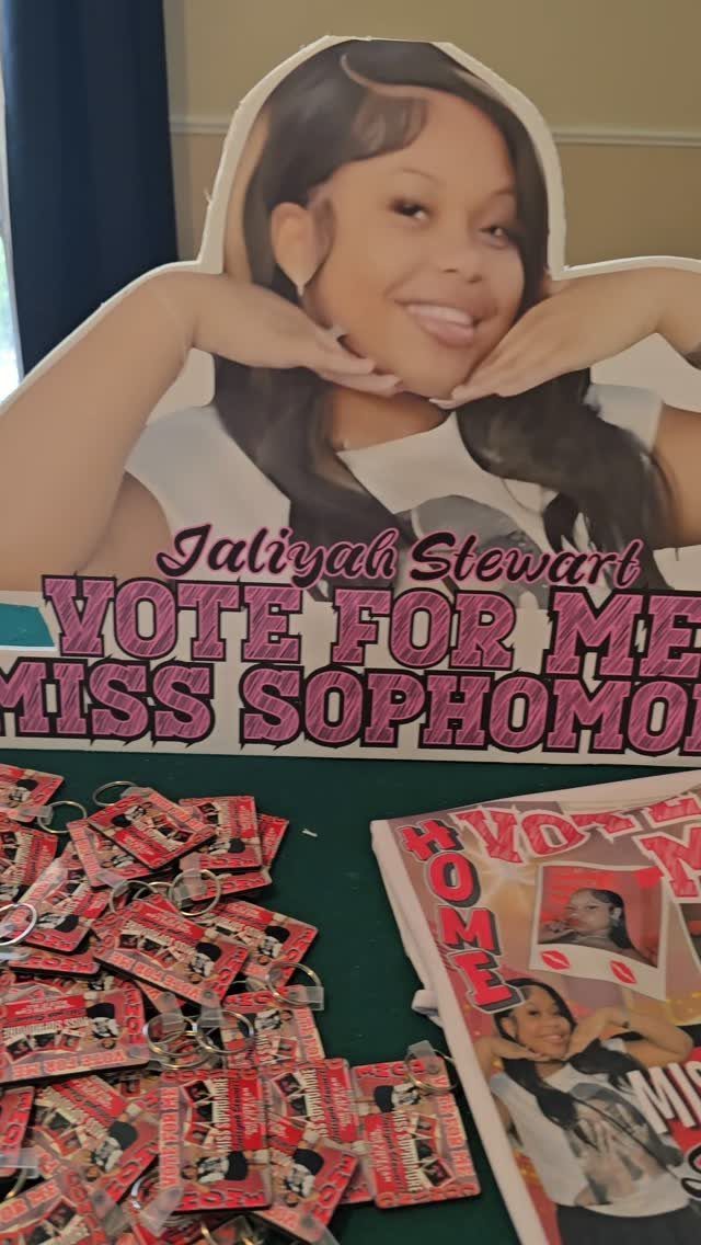
A full-body cutout of the candidate gets noticed because it looks like a person standing in the hallway. Print or mount a large photo on cardboard, trim around the outline, and put the name where it can’t be missed.
Pair it with small giveaways, like red flyers and keychains laid out in front.
I would pick the keychains over extra paper, since people hang onto something useful. Cutting around a whole body takes patience, so go slowly at the arms and hair.
9. Feather Boa Border
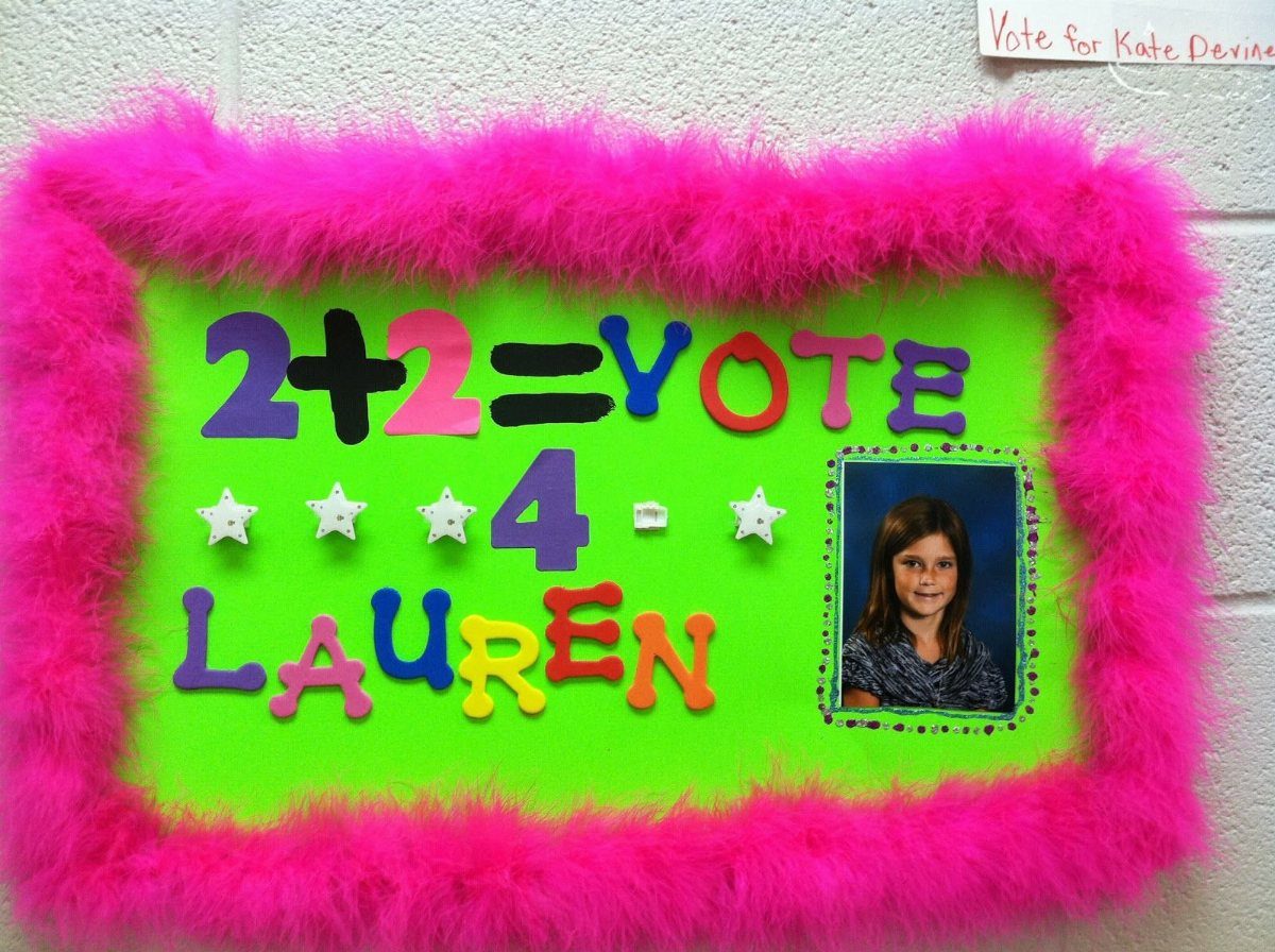
Fluffy trim makes a flat poster look like it has a frame, and a pink feather boa around a green board is loud in the best way.
Glue or tape the boa down along the edge, working in short sections so it stays put.
Cutout letters for a line like "2+2=VOTE 4 LAUREN" add depth if you layer them on the board.
Boas shed a little, so hang the poster away from where people brush past. A math pun suits a school hallway, and a small photo keeps the focus on the name.
10. Food Pun Theme
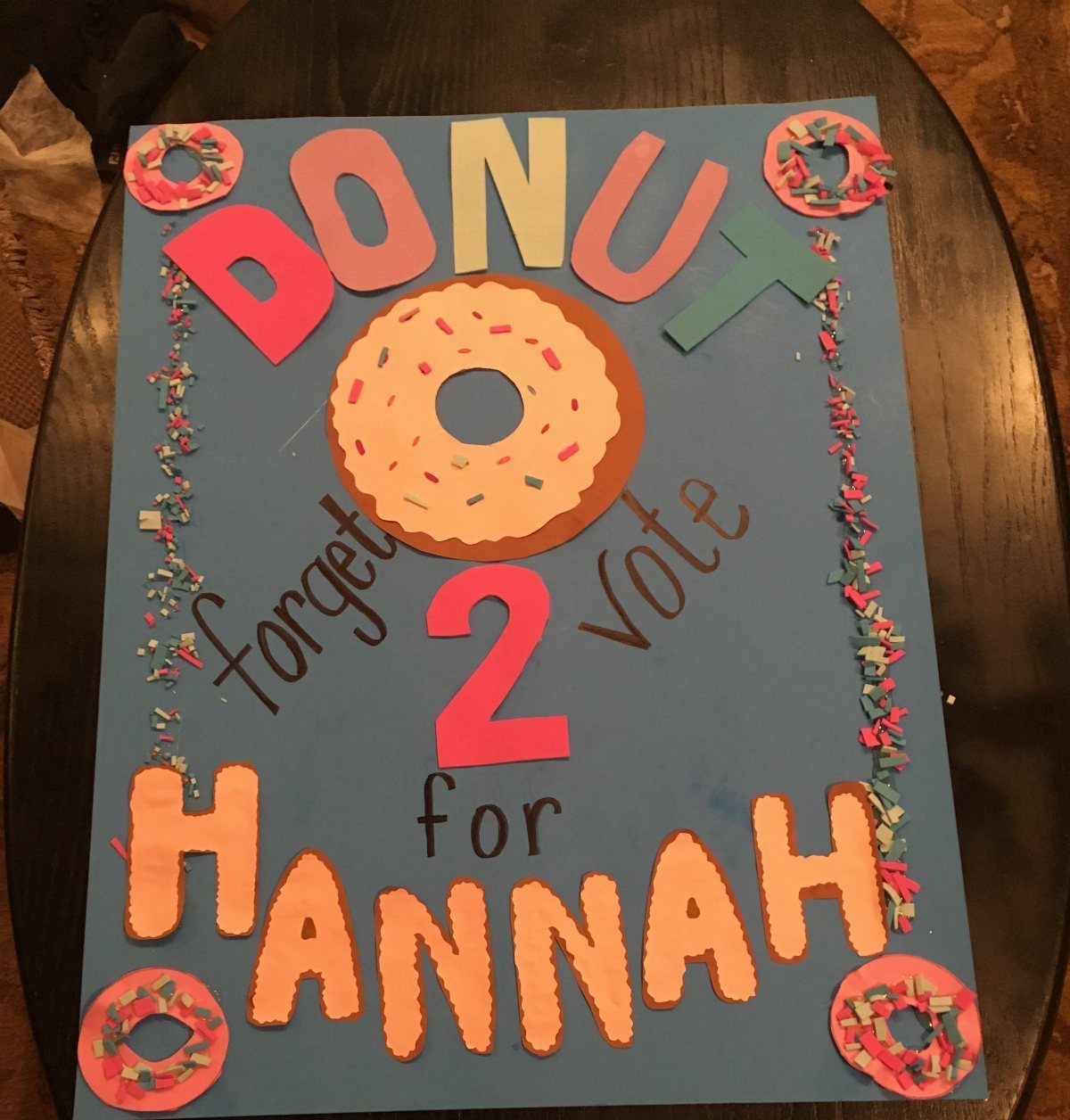
Food puns are the easiest jokes to build a poster around, and "DONUT forget 2 vote for HANNAH" shows why: the treat replaces a letter and the pun is clear at a glance.
Cut donut shapes from colored paper and add sprinkles with markers or small paper scraps.
A blue background makes the donut colors pop.
Pick one food and stick with it, because a second pun crowds the message. Write the candidate’s name in the largest letters.
Materials for Posters
Red poster board with a brown soda bottle drawn on it, a silver glitter cap and white text is a good model for how few materials you need.
Color does the work: one bold board, one drawn object, one sparkle accent.
White poster board suits the opposite approach. Colorful markers carry everything, so buy a pack with several shades and test them on scrap first, since some bleed through thin board.
A small personal photo is worth adding to either one. Print it at wallet size, trim it clean, and glue it in a corner so people connect the drawing to the face.
Keep glue sticks, scissors and a ruler on hand. Glitter belongs on small details like a cap, not on every surface.
Design Tips
Speech bubbles are an easy way to put words in the candidate’s mouth. Pair candidate photos with a short bubble, bold text and one background color, such as green, and the whole poster reads as a set.
Color blocking is another route. Red, blue and beige panels behind a stylized portrait, with the name set along the bottom, look planned even when you cut the shapes by hand.
Check legibility by taping the poster to a wall and stepping back before you commit to it.
Dark text on a light panel beats light text on a busy one.
Campaign Strategies
Candy does double duty as a campaign tool. Draw lollipops and a wrapped candy right on a white board, and you can match the real treats you hand out to the art, so the poster points to the giveaway.
Plan the handout before you make the poster. Count how many classmates you want to reach, buy one treat per person, and check your school’s rules on food first, since some campuses limit what you can pass out.
Interaction works best when it is quick. A person should be able to grab a treat, read the name and move on within a few seconds.