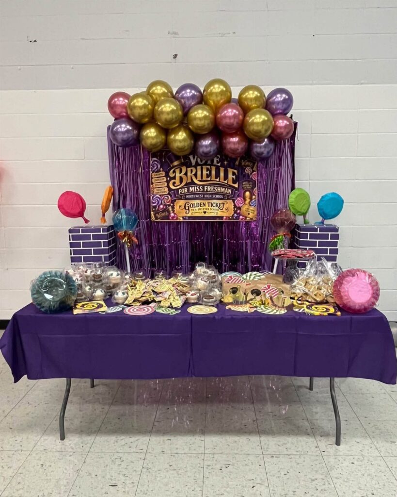
Posters here run from template-based files you can print tonight to handmade signs that cost a sheet of poster board and a pack of markers, so the choice depends on whether you have an evening and some design nerve to spare.
Either way, the candidate’s name and title in the largest lettering is what voters catch from across the hallway, so every idea below starts there.
Pick one color palette and one slogan from the Homecoming Theme Slogans idea, and repeat both on every sign; the display then reads as a single campaign instead of a pile of separate posters.
1. Personalized Nominee Posters
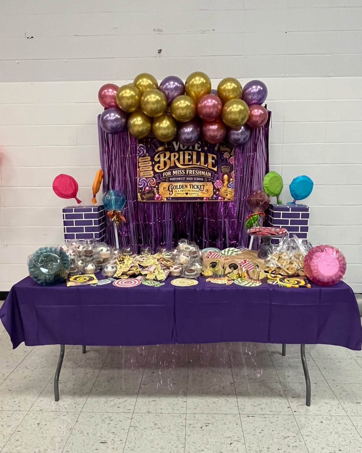
A poster with the candidate’s name and the office she’s running for, like "Vote Brielle for Miss Freshman," does most of the campaign’s work from across the hallway, long before the fine print gets a look.
Put the name and the title in the largest lettering, since voters walking past a table will catch only those.
Balloons and candy in the same colors as the poster make a table look planned rather than piled. I’d match the palette to your school colors so the whole display reads as one campaign.
Hallway posters for homecoming court nominees should be individualized and personal. Each poster should highlight who the candidate is and why everyone should vote for them.
2. Posters with Sports Balls
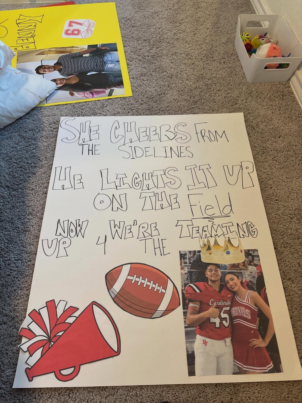
Sports balls give a poster a built-in focal point, and a football cutout does that job well.
Pair it with a megaphone and a short two-line rhyme or contrast, such as "She cheers from the sidelines, He lights it up on the field," and the page tells a story in seconds.
Keep the photo large enough to recognize from a few steps away, with the ball beside it rather than on top of the faces.
3. Homecoming Theme Slogans
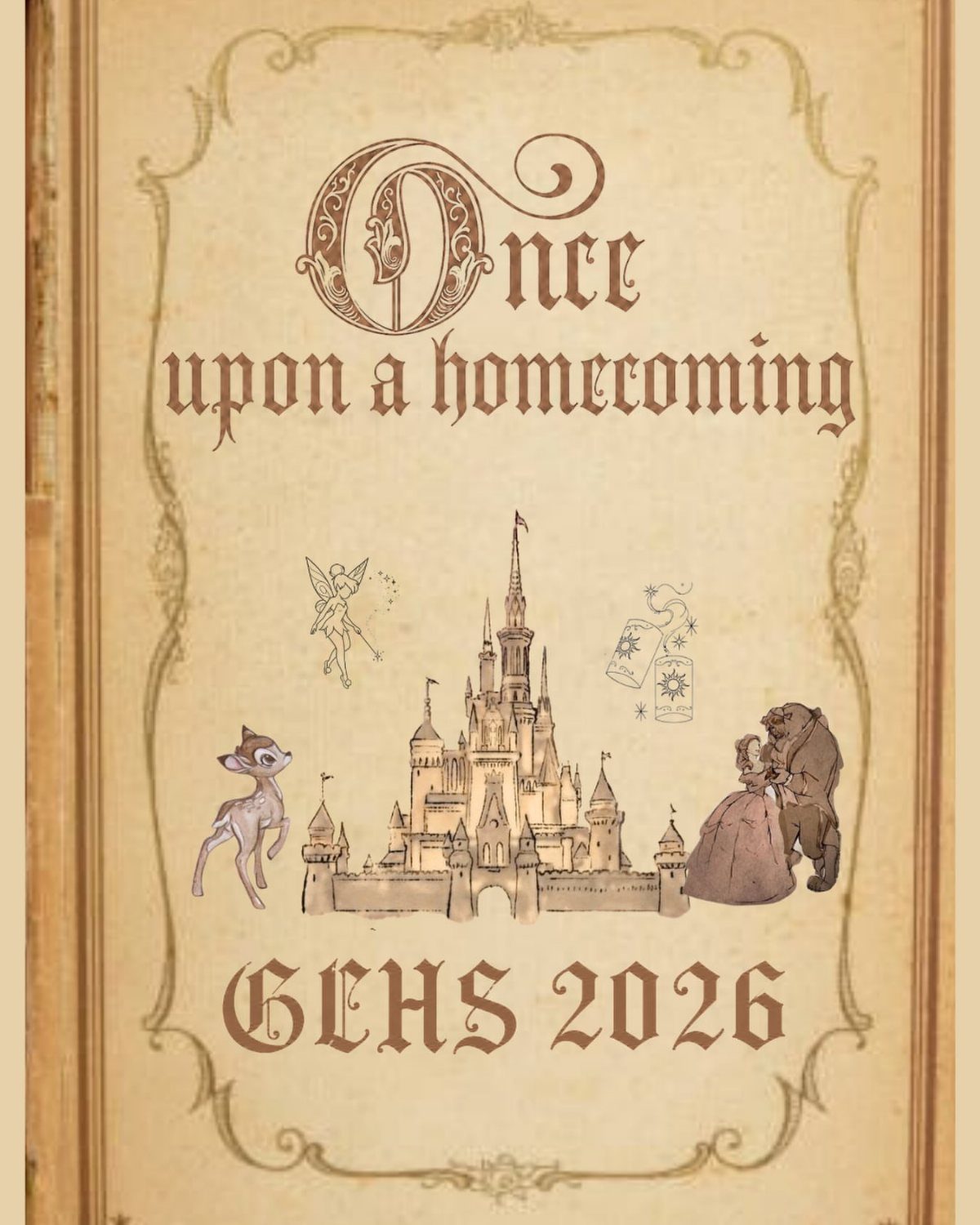
Choose one theme and run it through every poster, and the hallway starts to look like a single event.
"Once upon a homecoming" works because the phrase sets the story and leaves room for characters, a castle and a school-and-year tag like "GCHS 2026."
Pick a slogan short enough to take in at a glance, then use one ornate script for the headline only.
Ornate lettering on every line gets hard to read from across a hall, so I’d stick with plain letters for everything else.
4. Handmade Colorful Campaign Signs
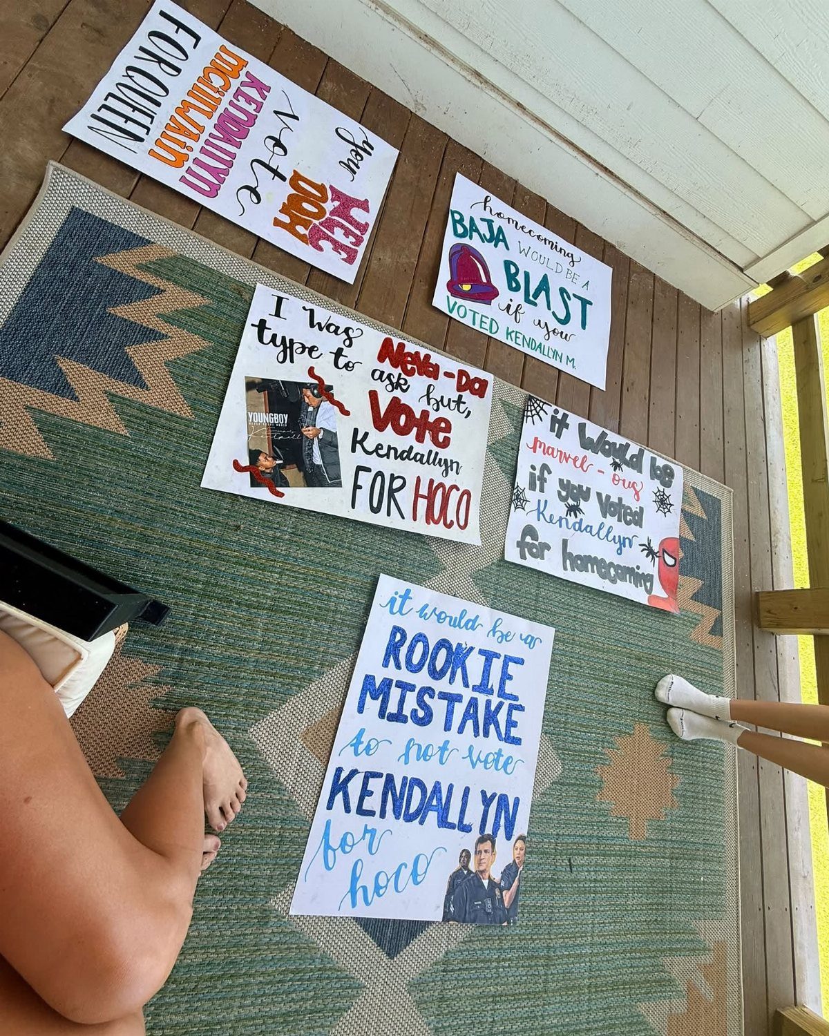
Handmade posters on white poster board let color do the talking. Bold lettering in several markers, as on the "Vote Kendallyn for Hoco" set, stands out against the plain background.
A joke line like "Rookie Mistake" gives each sign its own personality while the candidate’s name stays constant. Making several different signs gives you more chances to catch someone’s eye, and the cost is only board and markers.
I’d pencil the letters first, trace with marker, then erase the guidelines.
Using Templates for Posters
A free template tool like Kapwing gets a poster from blank screen to print file without any design skills. Pick a layout, swap in your colors, fonts, photos and text, then download it for printing or posting online.
I’d start with your school colors and one photo before touching anything else. Those two choices make a template look like yours instead of one everyone else is also using.
Print a test copy on regular paper first. Typos and cropped edges are far cheaper to catch there than on the final sheet.
Design Elements for Posters
A good template leaves room for both words and pictures. You want space for a school color scheme, a mascot or a personal photo, with nothing crammed against the edges.
Check the fonts before anything else. Bold, readable type matters most for the headline and for details like the date and time, so skip any layout that makes those small.
Crowns, stars, football helmets and formal dress silhouettes do half the work before you write a word. I’d choose the balanced, uncluttered layout every time, since you can always add decoration and can rarely remove it cleanly.
Versatile Uses for Posters
One template can cover a lot of jobs, so build a single design and adapt it. For school use, that means official announcements, court voting campaigns, game day promotions and dance advertisements.
That same design serves as a promposal sign, a group shot poster for friends attending together, an announcement graphic for Instagram, or a thank-you display afterward.
Change the message and the photo, and keep your colors and fonts the same. I like that approach because every piece then looks like it came from the same person.